How to Choose the Right Colours for Your Render
17 Dec 24 | News | 5 Min read
Selecting the right colours for a 3D render is a vital step in the creative process. Whether you’re working on architectural visualisations, product design, or a cinematic scene, your choice of colours can greatly influence the final outcome. Colours help establish the mood, draw attention to key elements, and communicate your intended message. This guide provides practical advice on how to make thoughtful colour choices for your renders.
1. Start with the Purpose of the Render
Understanding the purpose behind your render is essential when selecting colours. Consider these examples:
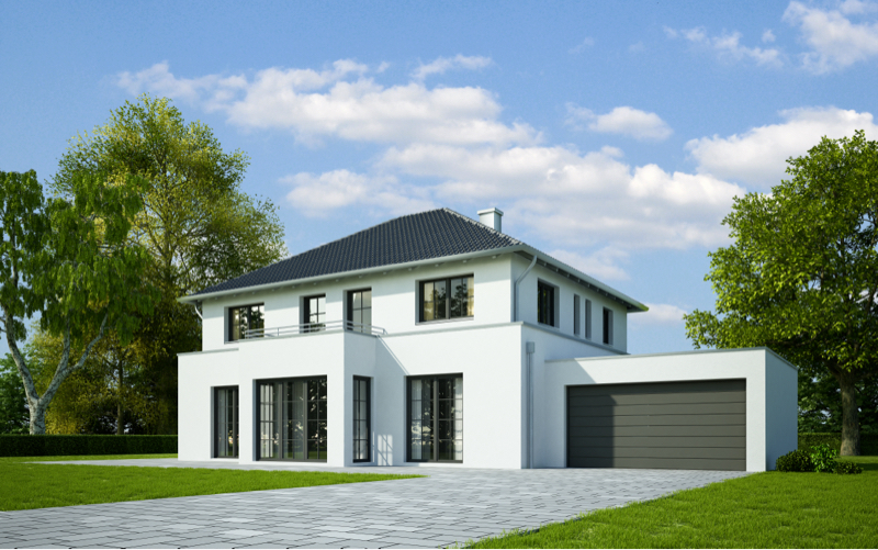
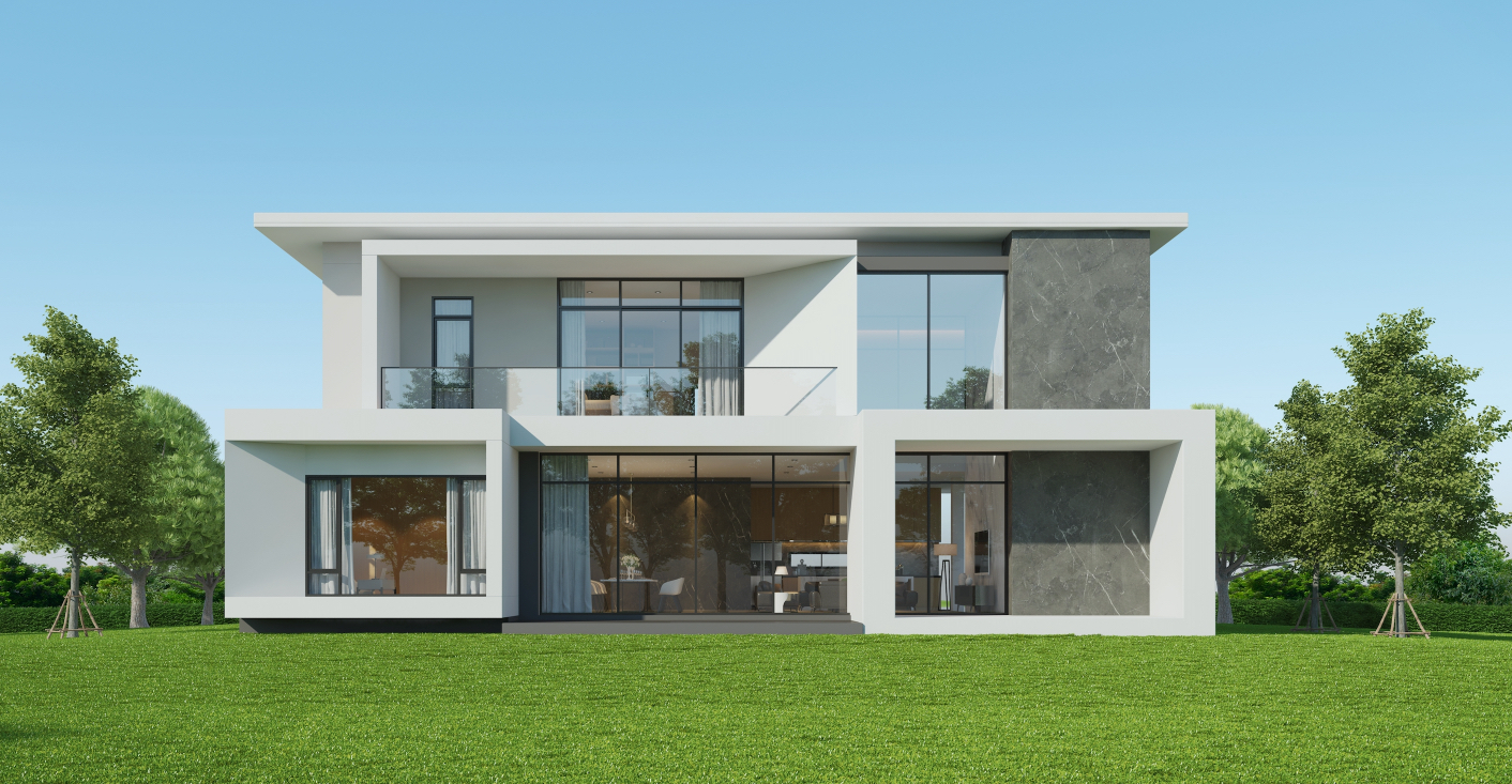
• Architectural visualisations: The goal is often to highlight materials or convey the atmosphere of a space. Colours should complement these elements.
• Product renders: Colours need to enhance the product’s design and features while making it visually appealing.
• Cinematic or storytelling renders: Your colour palette should support the narrative or evoke the desired emotional response.
The intended use and target audience of your render will guide your choices and ensure the colours align with your overall vision.
2. Learn the Basics of Colour Theory

A good grasp of colour theory can make a significant difference to your renders. Here are some key principles:
• Complementary Colours: Colours opposite each other on the colour wheel (e.g., blue and orange) create strong contrast and draw attention.
• Analogous Colours: Colours next to each other on the wheel (e.g., blue, teal, and green) create a harmonious, cohesive look.
• Triadic Colours: Using three evenly spaced colours on the wheel can bring vibrancy and balance to your scene.
These relationships provide a foundation for crafting colour combinations that are both effective and aesthetically pleasing.
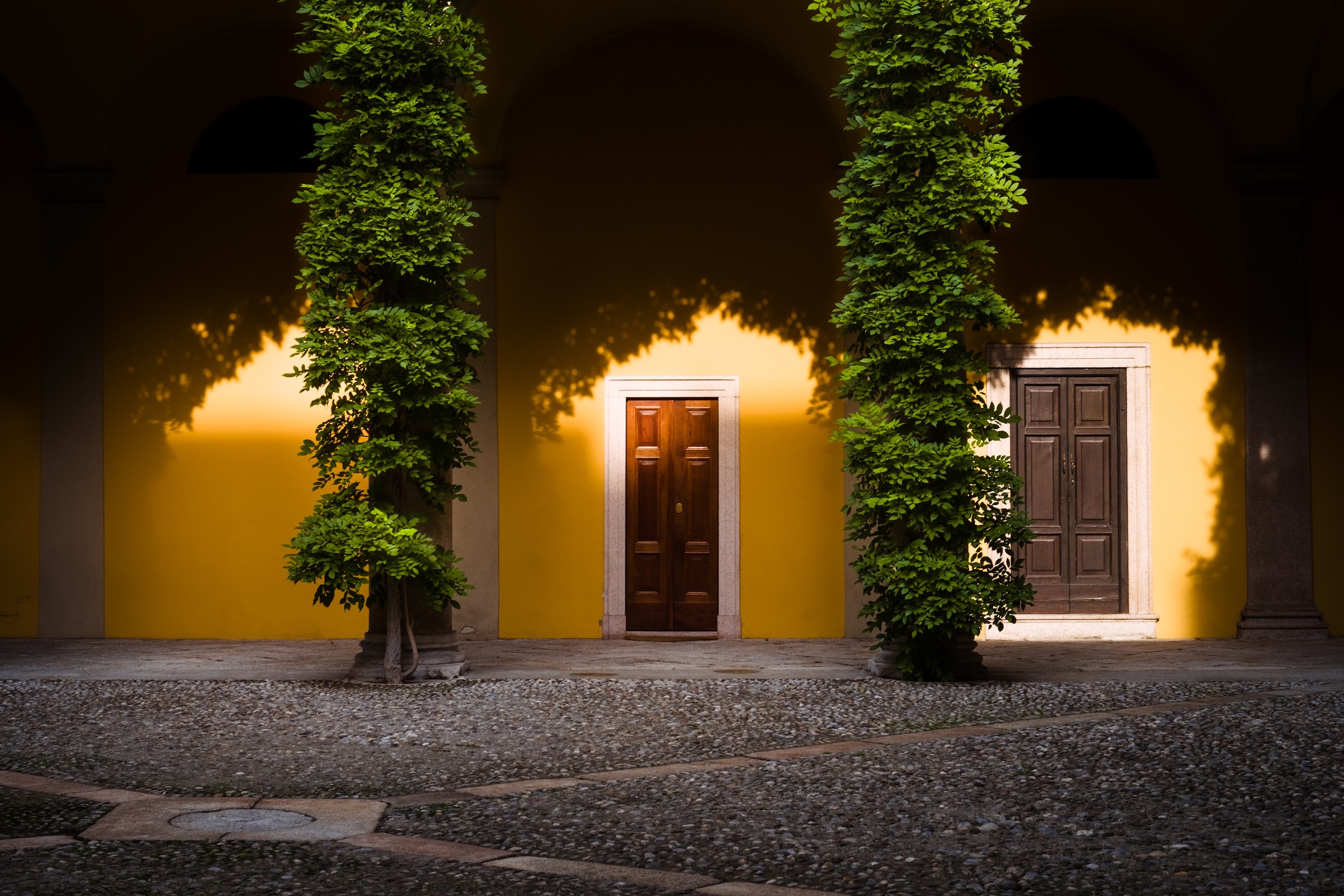
3. Consider Mood and Emotion
Colours are powerful tools for setting the tone of a render. For example:
• Warm colours such as reds, oranges, and yellows evoke energy, warmth, or passion.
• Cool colours like blues, greens, and purples create a sense of calm, professionalism, or tranquillity.
• Neutral tones such as grey, white, and black add sophistication and versatility, often acting as subtle backgrounds or complementary shades.
Decide on the atmosphere you want to create, then choose colours that reinforce that feeling.
4. Account for Lighting
Lighting significantly impacts how colours are perceived in a render:
• Natural Light: Creates warm tones during sunrise and sunset or cooler tones in midday light.
• Artificial Light: The colour temperature of artificial light sources (e.g., warm yellow or cool blue) can affect how colours appear.
• Reflections and Global Illumination: Light bouncing off surfaces may alter the perception of colours in your scene.
Always test your colour choices under the lighting conditions present in your render to ensure they look as intended.
5. Match Colours to Materials
The colours you choose should work harmoniously with the materials in your scene:
• Reflective Materials: Metals and glass reflect their surroundings, so their appearance will depend on your colour palette.
• Matte Surfaces: These absorb more light, making colours appear deeper and less vibrant.
• Textured Materials: Materials like wood or fabric may subtly alter how colours appear due to shadows and surface details.
Choosing the right colours enhances the realism and overall appeal of the materials in your render.
6. Seek Inspiration
When you’re unsure where to start, draw inspiration from similar projects or real-world examples:
• Photography: Real-world images of similar environments or objects can guide your palette choices.
• Online Tools: Websites like Adobe Colour or Coolors are excellent for generating harmonious colour schemes.
• Mood Boards: Collect images, textures, and colours that align with the vision for your render.
References and inspiration can provide a strong starting point for developing your colour scheme.
7. Balance and Contrast

A great render achieves a balance between harmony and contrast:
• Focal Points: Use contrasting colours to draw attention to key areas of your scene.
• Backgrounds: The background should support the main subject without overwhelming it.
• Depth: Employ variations in brightness, saturation, and tone to create a sense of depth and dimension.
Balancing these elements ensures your render is visually engaging and focused.
8. Test and Refine
Creating a successful render often involves trial and error. Once you’ve settled on a colour scheme, produce test renders to evaluate your choices. Ask yourself:
• Do the colours work well together?
• Do they achieve the desired mood or tone?
• Does the focal point stand out clearly?
9. Stick to the Theme
If your render follows a particular theme, ensure the colours align with it. For example:
• Futuristic scenes: Neon blues, purples, and bright whites create a cutting-edge aesthetic.
• Natural settings: Earthy tones such as greens, browns, and muted neutrals evoke calmness and authenticity.
• Industrial designs: Cool greys, blacks, and metallic shades work well, often paired with bold accent colours like yellow or red.
Staying true to your theme ensures consistency and enhances the overall impact of your render.
10. Keep it Simple
Here are some common mistakes to avoid:
• Using Too Many Colours: A palette with too many colours can overwhelm the viewer. Stick to 2–4 main colours, using others sparingly for accents.
• Overusing Saturation: While vibrant colours can be striking, they should be balanced with softer tones to avoid a garish appearance.
• Ignoring Context: Consider where and how your render will be displayed to ensure your colour choices are suitable for the context.
A simple and deliberate approach will result in a more polished and professional final render.
Choosing the right colours for your render involves creativity, precision, and attention to detail. Start by defining the purpose and mood of your project, and use lighting, materials, and references to guide your decisions. Remember to test and refine your choices as you go, and keep your theme and context in mind. With a thoughtful approach, you’ll create renders that not only look stunning but also communicate your vision effectively.